Yield Risk Forecast
Overview
Treefera is an AI-native first-mile intelligence platform that gives supply chain teams visibility into where commodities are actually grown, connecting satellite data, climate signals, and land information to help organisations understand risks at the source.
The Projects section is a new part of the platform where users can access intelligence tailored to their specific needs, built around templates for different use cases. I led the design of this section, and this case study focuses on one of those templates, particularly the Yield Risk Forecast, the first intelligence template designed and shipped within the Risk Intelligence pillar.
Role
Lead Product Designer
Team
Risk Intelligence
Role
PoC: 2 Weeks
PoC: 2 Weeks
Skills
Research
AI Discovery
AI Ideation
AI Prototyping
Testing
The Problem with First-mile Visibility
Most organisations have good visibility into the middle and end of their supply chains, but very little into where commodities are actually grown. This gap is costly. Disruptions at the source ripple through the entire supply chain, and by the time they're visible, it's usually too late to react.
Treefera’s platform addresses this by connecting satellite imagery, weather and climate signals, soil data, and supplier information into a decision layer. The challenge from a design perspective was: how do we surface deeply technical, multi-layered agricultural data in a way that drives clear, confident action for very different user types?
User Types and Their Needs

Traders & Analyst
Need weekly production forecasts before market consensus forms.

Financial Services
Quantify downside risk exposure across commodity portfolios.

Supply Chain
Replace fragmented manual assessment with real-time stability signals.

Agriculture & Forestry
Plot-level evidence for carbon, deforestation, and practice verification.
Research
Understanding a Complex Domain
Designing for agricultural risk intelligence meant bridging two words: the data scientist building the models, and the people who would actually use the output to make decisions.
We focused on these areas:
We ran sessions with Treefera's data science team to understand what each signal actually meant, what the models could say with confidence and where the limits were.
User Mental Models
Risk professionals think in terms of exposure, probability and severity, not agricultural metrics. We needed to understand that gap before we could design across it.
Analogous Interfaces
We looked at financial risk dashboards, climate platforms and geospatial tools to find interaction patterns that would already feel familiar to our users.
An Intelligence Layer, Not a Data Dump
A Projects section within the platform built around three intelligence pillars, each designed for a different type of user and need.
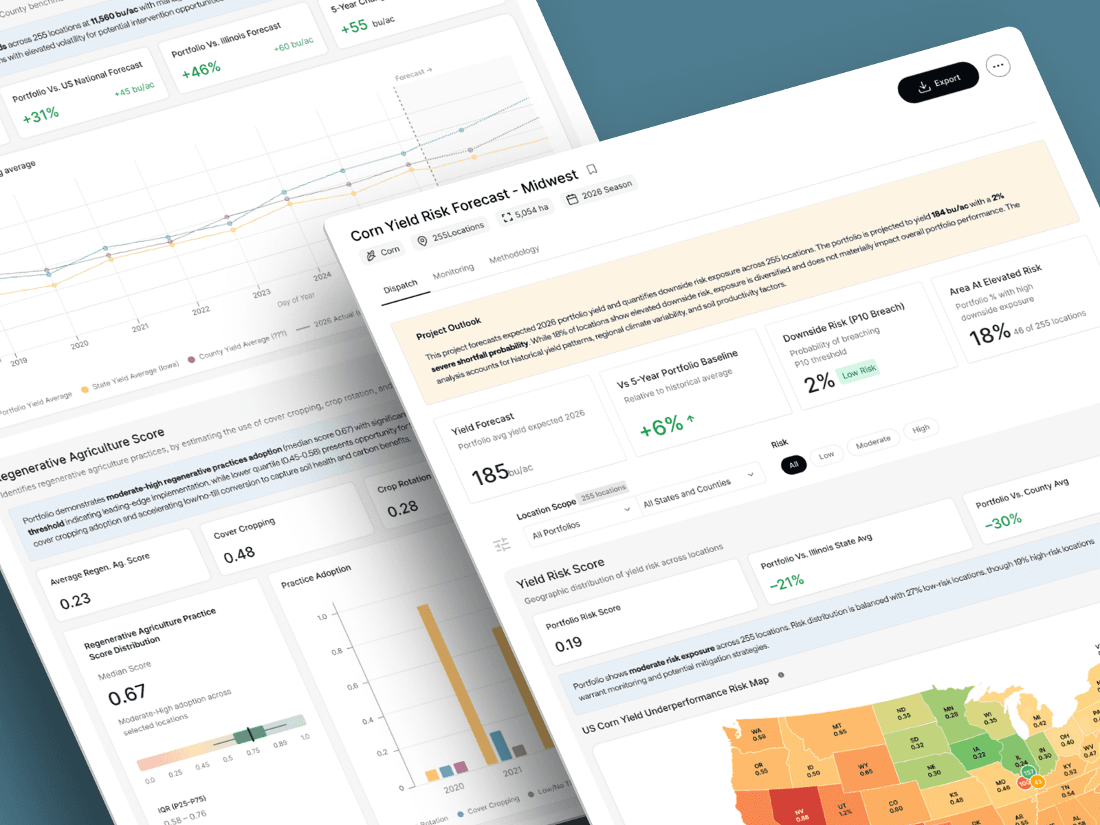
For the Yield Risk Forecast specifically, the goal was to give users four things in one place: a portfolio-level summary, a spatial view of where risk is concentrated, historical and forward yield context, and signals around regenerative agriculture practices.
The key insight was that users needed answers, not data. The interface had to lead with the interpreted conclusion and let them dig into the evidence if they wanted to, not hand them a chart and ask them to figure it out.
From Ambiguity to a Working System
The process was iterative, with close collaboration between design, data science, and product throughout.
Stakeholder alignment & domain immersion
Worked closely with data scientists and product leads to understand the underlying models, what data could actually say and with what confidence interval.
Competitive and analogous research
We looked at how similar problems were solved in adjacent domains to find patterns that would feel intuitive to our users.
Information architecture
With the help of new available AI softwares we mapped out the full set of data intelligence and organised them into a clear hierarchy.

Designing the Intelligence Layer
The main question during ideation was how to structure the age so different types of users could get what they needed without feeling overwhelmed. A trader scanning for a quick signal and a risk analyst doing a deep dive have very different needs, but they're looking at the same screen.
We landed on four key decisions
Lead With the Summary
The Project Outlook sits at the top of the page with a plain-language read of the portfolio state. Users who need to act fast get the answer without scrolling.
Progressive Depth
The page moves from high level to granular: portfolio summary, risk map, yield chart, regenerative agriculture score, location table. Users go as deep as their decision requires.
AI - Generated Insight Callouts
Each section has a short interpreted summary of what the data is saying, so users always have a starting point rather than a more technical chart to read.
Flexible Scoping
Users can switch between portfolio, state, and country level, and filter by risk level, so they can zoom in on what actually needs their attention.
Shipping the Yield Risk Forecast module
The PoC delivered a fully functional design for theYield Risk Forecast module, validated against real data outputs from Treefera's models. The design covered five promary components:

Project Outlook
Plain-language portfolio summary with four KPI cards: yield forecast, vs baseline, downside risk probability, and area at elevated risk.

Risk Map
Geospatial view of yield risk across all locations, clustered by risk level with colour-coded markers and filtering by scope and risk tier.

Yield Forecast Chart
Historical and projected yield comparison against US average, with benchmark toggle and confidence band for forward projections.

Regenerative Agriculture
Portfolio-level regenerative practice score distribution alongside practice adoption breakdown (crop rotation, cover cropping, no-till)

Project Locations Table
Full location-level data table with expected yield, yield risk rating, and downside probability; sortable, filterable, and pagintated.
The PoC was used to align engineering on scope, validate the component system with the design team, and demonstrate the intelligence product concept to early customers and investors.

0 to 1 Intelligence Product
Delivered the first fully designed intelligence module on the Treefera platform, establishing a reusable pattern for Market and Environmental Intelligence pillars to follow.

Design System Foundation
The components built for Yield Risk Forecast became the base design system for the entire Projects section.

Stakeholder Alignment
The PoC resolved long-running ambiguity about how intelligence products should be structured, giving the product and engineering teams a shared, concrete reference point.

Customer and investor validation
The designed module was used directly in customer discovery conversations and investor presentations, receiving positive feedback on the clarity of the intelligence surface.
The Yield Risk Forecast was the first template, but the work didn't stop there. The next priorities were:
Testing with real customers
Taking the PoC to actual users to validate the interaction model, understand where the design held up and where it needed to change.
Iterating based on feedback
Using what we learned from testing to refine the template before scaling the pattern to other use cases.
Building more Risk Intelligence templates
Applying the same design base to other risk and compliance needs, using the Yield Risk Forecast as the foundation to move faster on each new template.
Scaling the system
As more templates get built, the component library grows stronger, making each new intelligence type quicker and more consistent to design and ship.